


Will Design for Mobile Soon Be More Important than Design for Desktop Environments?
In 2010, Mary Meeker of Morgan-Stanley predicted that mobile web would outpace desktop web in five years[1]. Gartner’s recent prediction takes it a step further, stating that it will happen by 2013[2]. Currently, mobile design is an afterthought: design a fancy desktop experience, eliminate a few elements that interfere with mobile experiences and voila! This approach doesn’t take into account mobile users’ real need: a mainline to topical, useful information so they can put their phone back in their pocket and get on with their day. Mobile users are transaction-driven. They aren’t typically interested in browsing or searching too long for their answers. In other words, what your mobile site needs to contain is contextual and topical content tailored to the user’s specific location, patterns and connections.

Consider the typical Wells Fargo bank user, freshly in San Francisco and in need of an ATM. Wells Fargo’s desktop experience would be a nightmare on a smartPhone. Long columns of tightly-packed links, the ATM search box buried near the bottom, and a landscaped format that causes all content to wrap all combine to create a frustrating experience for someone standing on a street corner relying on their spotty 3G or 4G connection.
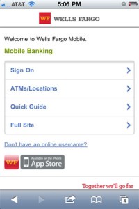
The iPhone version, however, has text-based links (quick load time) with the information most relevant to a mobile user (grouped by a hierarchy that was probably established through extensive user-testing). Clicking the ‘find ATMs’ button takes you to a page that searches by current location or by specific ZIP. Even on a 3G connection it takes seconds to connect.
What does this mean for design?
Web designers will have to adapt to this new shift in focus with appropriate changes in their design. The following are the top aesthetic changes the mobile revolution will bring about:
- More minimalist designs with an emphasis on content hierarchy
As I told a class I taught on web typography in 2009, content is king. It is our job as designers to present that content in an approachable and pleasing way, but we should never forget we are there to make the content pleasing. I have always attributed it more to apparel design than graphic design: you don’t try to make the dress look good on every woman, you try to make every woman look good wearing the dress! - More variable (vs. fixed-width) design
Variable CSS styles (ems and percentages) calculate the size relative to the browser. Because of this, they are superior to fixed-width styles that are born from pixel-perfect design comps in many ways. They can be leveraged for a variety of desktop resolutions as well as work as a stand-in until your client gets around to revisioning their mobile experience. - Full embrace of HTML, CSS3, and jQuery over Flash
Well before Steve Jobs admitted it out loud, Flash was getting slowly shoved out of the limelight. As I’ve stated before, it was great for what it was made for, but current technologies have come into their own and provide the same experience to a broader audience for a fraction of the development time. - The illusion of depth created with CSS3 and parallax scrolling
As CSS developers begin to play with the tools that CSS3 has to offer they will create new and more sophisticated uses of such features as rounded corners and dropshadows, the canvas feature, @font-face and parallax scrolling (a special scrolling technique in computer graphics, popularized in the 1982 arcade game Moon Patrol.[1][2] )
Mobile users are all-too-happy to hand out personal information in exchange for convenience. Mobile sites provide a perfect way to make the exchange of their almost-certain leads for your content, but you have to understand how to tailor content to your audience.
Sorry, the comment form is closed at this time.