
If you have ever looked at a map, you have, without knowing, interacted with an infographic! What you might remember about that map is that it made it easy for you to find what you were looking for.
Data is complex, dynamic, and multi-dimensional; the computer screen (at least to the human eye) is flat and relatively static. How, then, can one represent and distill the multitudes of experience and quantitative information with mere words and pictures? The Infographic.
Organizing complex data for clarity and visual digestion is one of the oldest forms of efficient communication. In the late 18th Century, William Playfair —a political economist and engineer credited with the invention of area and pie charts, used infographics to illustrate the state of the English economy. A century later, Florence Nightingale similarly employed them to convince Queen Victoria to improve conditions in military hospitals. Since 90% of the information transmitted to the brain is visual, it makes sense why these great minds relied on infographics to make their point.
Infographics are a proven way to get attention, engage with your audience, and build brand awareness. Visual content on websites and social platforms continues to outperform basic text. For example: Facebook images are liked 12x more than text updates, 42% of all Tumblr posts are photos, and photo and video posts on Pinterest are referring more traffic than Twitter, StumbleUpon, LinkedIn, and Goolge+. In fact, Facebook updated its brand page layout this March to emphasize storytelling through photos and video. Publishers using infographics see a 12% increase in traffic versus those who don’t.
It is important to choose a format that is best suited to your information, goals, and the point you are trying to convey. Here are a few different types and reasons for using infographics to get your ideas flowing:
1. Make statistics compelling: A statistic-focused infographic is great for sharing data patterns, trends, or highlighting the relationship between two data sets. Maybe you found an interesting relationship between geography and mobile activity that is useful to your audience, or you seek to highlight product sales internally for a particular demographic. Order the information to share your most compelling statistic first, and then build the case for the point you are trying to make.
2. Tell a story: A chronologically ordered infographic is perfect for telling your story. Perhaps the research you funded provided scientific breakthroughs that affected millions of families. Maybe your product changed the way people use their computers. Focus on the most compelling pieces of information and contextualize them.
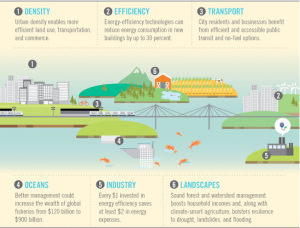
The World Bank shows the consequences of our way of living, and the benefits of switching to green technologies.
3. Explain how something works: A diagrammatic infographic is helpful for explaining processes and structures. A large part of successful marketing is about educating your audience. What if you need to show how a product works, or explain your organizational structure to potential investors? In these situations, it is imperative to show the information rather than tell it.

Creative illustrations on how your phone, camera, and other things work.
Now that you know the type of visualization that is best suited to each need, the next step is to start creating! Check back next week for tips and best practices for designing your own infographic.

