Google Analytics is a powerful tool for providing insights into how visitors find and interact with your website. Harnessing this power can positively impact your company’s bottom line.
But with so much data at your fingertips, it can be overwhelming to know what to focus on and the best way to collect and report on that data.
Mambo Media’s Google Analytics IQ-certified aces have combined our years of experience to come up with some of the most important and insightful analytics to keep your eye on each month.
So don’t fret, in this two-part blog post we’ll help you make your monthly data reporting a breeze. First, we’re giving you an overview of GA dashboards, and next, we’ll show you how to create them.
Make data collection easy with Google Analytics dashboards
There’s so many ways to slice, dice and report on data from your Google Analytics account that sometimes it can feel like an overwhelming task to compile your data into a cohesive and meaningful report each month.
Enter dashboards.
Dashboards are a way for users to access a simplified overview of the metrics you care about most. They are easy to create with default features but also customizable should your organization have unique reporting requirements.
You can create a new Dashboard by clicking + New Dashboard link in the reporting menu. You can then select a blank dashboard, a Starter Dashboard or you can Import from Gallery to take advantage of dashboards the Google Analytics user community created.
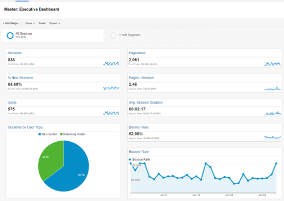
Dashboards are driven by a collection of widgets that quickly provide you metrics at a glance so you can evaluate the health of your site and analyze the side-by-side interplay between different data points.
You can begin to add widgets via the + Add Widget button or edit your Starter Dashboard widgets via the pencil icon in the upper right of a widget when you hover your mouse over it.
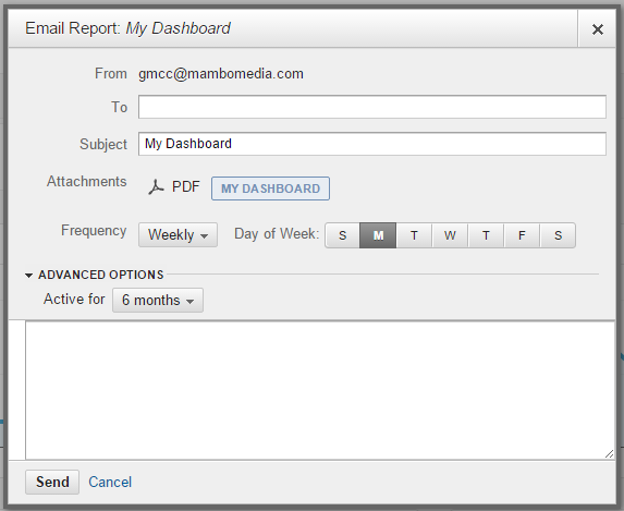
What makes dashboards most useful for your reporting – beyond pulling in many different metrics in one place – are the sharing capabilities. You can easily download a PDF report for your next presentation or send a one-time or recurring email with your report to match your reporting cycle needs.
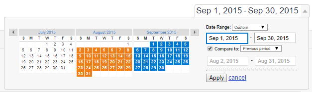
An insightful way to see how your data has changed between two time periods is to use the “Compare to” option in the date range dropdown. When comparing two date ranges, Google Analytics will expand your dashboard to include data from both so you can easy see the changes next to each other.
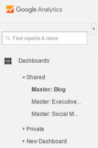
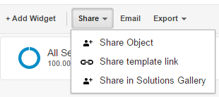
It is important to note that if you have multiple users accessing your Google Analytics account and you want them to be able to see your dashboard, you must share your dashboard with them. To do so, select “Share Object” under the Share menu in each of the dashboards you wish others to see. This will move the dashboard into the Shared folder rather than in your personal Private folder where you built the dashboard.
To dig into how to develop useful dashboards, read the second part of this blog post with instructions on building Mambo Media’s favorite widgets to add to the three dashboards we find most useful.