In our previous blog post we explored the concept of Google Analytics dashboards and how they can help make your monthly reporting faster and easier. In this post we’ll dive into how to build Mambo Media’s favorite dashboard widgets in the three dashboards we find most useful.
How to Build Mambo Media’s Favorite Google Analytics Dashboard Widgets
Google Analytics dashboards are only as good as the widgets you add to them. Keeping in mind you can currently only add 12 widgets per dashboard, we prefer to create three different dashboards; Executive, Social Media, and Blog. Let’s run through some of our favorite widgets we add to each of these three dashboards.
Executive Dashboard Top Widgets:
This is a great dashboard for the executives you report out to. This dashboard should house the upper-level metrics that will give a snapshot of your site’s health. Widgets that we like to add to this dashboard include:
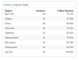
1. Visitor’s Origin by State or City
This is a Table-based widget to provide a sense of where site visitors to your site are coming from. When building this widget we add the metric of Sessions and % New Sessions to understand the relative traffic coming from a given region or city and how much of that traffic is new versus returning. This can provide insight into potential geographic regions that may be worthy of additional marketing attention or an indication of targeted marketing success.
Sometimes this widget can alert you to possible spam traffic should an unexpected geographic region appear in a cities or countries widget. If that’s the case, you can click on the blue hyperlinked title of the widget to access the underlying report to investigate further. A nearly 100% bounce rate from a certain location with a zero Average Session Duration can be a strong indication your site is experiencing
spam traffic worth filtering out.
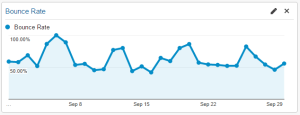
2. Bounce Rate Timeline
A Timeline-based widget is a great way to visualize how the Bounce Rate of your site is changing over time. You’ll find peaks and valleys to analyze in your data to better understand what may be influencing your site’s Bounce Rate.
Social Media Dashboard Top Widgets:
Knowing how well social media is driving traffic to your site and with what type of content is essential to building a solid social media content and advertising strategy. We start with the following widgets:
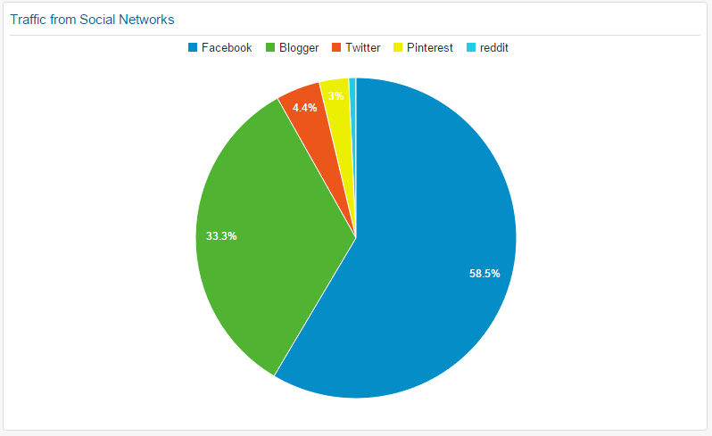
1. Traffic from Social Networks
A great way to understand which social channels are referring the most traffic to your site is through this Pie-based widget. When building this widget we use the Sessions metric and group by Social Networks dimension to be able to visually see the traffic distribution of the top social channels.
Channels with a smaller slice of the pie could indicate channels in need of increased engagement from your company or perhaps channels that are not well-suited to your message. This widget is a good stepping stone to dive deeper into how these visitors engage with your site once they arrive by clicking on the widget title to access the underlying report holding additional data.
2. Top Content from Social Networks
Knowing what content is getting the most traction with your social visitors is important to learning about your audience and what resonates with them the most. To discover these insights we like to add a Table-based widget with the Page Title metric and Sessions as the dimension and then filter the data to show only Social Source Referral traffic. You can also add Ave. Session Duration as a dimension to see how long these visits are staying on your site. This provides a quick look at what is performing best on your social channels.
Blog Dashboard Top Widgets:
Maintaining a successful blog takes a fair amount of time and effort. Don’t waste your time writing a blog post you hope will resonate with your audience. Learn from your Google Analytics data so you know what topics work best for your audience and the most effective marketing avenues to get your posts found. We begin building our blog dashboards with the following widgets:
1. Top 5 Blog Referral Sources
Knowing what sites are driving traffic to your blog is an important part of developing your marketing strategy. We build this Table-based widget with the Source metric and Sessions dimension. You can also add the dimension of Ave. Session Duration to see how long these visits are staying on your site on average to get a sense of their level of engagement. If you do not run your blog on a subdomain, be sure to filter this to Landing Pages containing the portion of your site’s URL for your blog, often /blog/ for many sites, and also filter Traffic Type exactly matching referral.
2. Top 5 Blog Posts
Like the Top Content from Social Networks in the Social Media dashboard, the Top 5 Blog Posts widget is essential to understand what is resonating with your audience. Build this widget similar to the Top Content from Social Networks but also filter this widget to Landing Pages containing your blog URL to ensure you’re only seeing blog posts in this widget.
Now that you have dipped your toes into the Google Analytics dashboard waters, what are your favorite widgets that you can’t live without?
If you’re ready to learn more about the power of Google Analytics reporting for your company’s bottom line, contact Mambo Media today to see how we can help grow your business.